If you are designing your new kitchen or renovating it, you will know that there are many colours to choose from. Too many in-fact . The possibilities of combining floors, cabinets and household appliances are endless, but you want that palette that fits with your kitchen; with the personality you want to give it. Is it a place where you only have breakfast? Is it a family gathering space? Do you want a space that inspires relaxation or activates your energy? If you have it clear, here is a small guide to help you choose the colours and tones of your kitchen.
Step One: Understanding the colours
There are two ways to classify colours, and although they work at different scales, they are not a problem when choosing. You can find them classified with a pad and six figures in front (hexadecimal system) or with the pattern 'PANTONE 1234 C'. Although there is no exact correspondence, you can search the Internet for almost absolute similarities or ask for help from professionals.
Step Two: Inspiration
It will be much easier for you to visualise your design inspired by existing palettes. In addition to the interior design catalogs, we recommend that you use Pinterest galleries, where colour combinations and model kitchens are presented. Another of your great allies may be social media accounts like Kitchens of Instagram. Remember to evaluate your budget while being inspired to ensure that you can take on the design.
Step Three: Colours of the cabinets
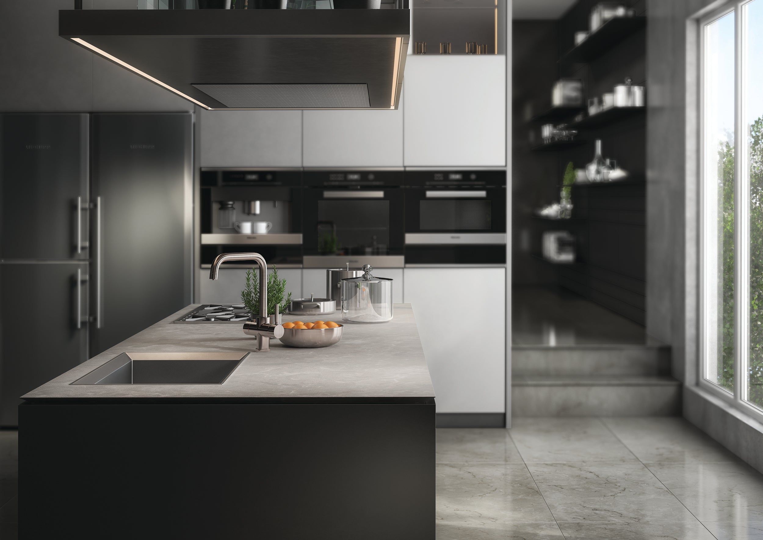
It is recommended that you give priority to the choice of cabinets, because these usually occupy an important part of the space in your kitchen. The colour you choose is going to be 40% of the total space. Therefore, select a base colour that fits the personality of your kitchen and try to stick with it. If the colour of the floor and cabinets are in harmony, then most of the work is done.
Step Four: The floor
If you have considered changing the floor, look at the materials. Wood, tile or ceramic are some of the popular options, but you can also opt for microcement or laminate floors if you are looking for resistance. An easy way to pick colour is to make it dominant. It should complement the cabinets, but contrast.
Step Five: The walls
If you choose a safe colour, it is very difficult for you to go wrong with the wall. Off-white, cream, or soft cement grey suits almost every shade. If you are looking for more vibrant tones, dare with mint green, powder blue or an aged pink if you have brass taps. It is very important that you value the light you have: the natural light tends to lighten the tones, and artificial lighting can alter them.
Step Six: Taps, plugs and knobs
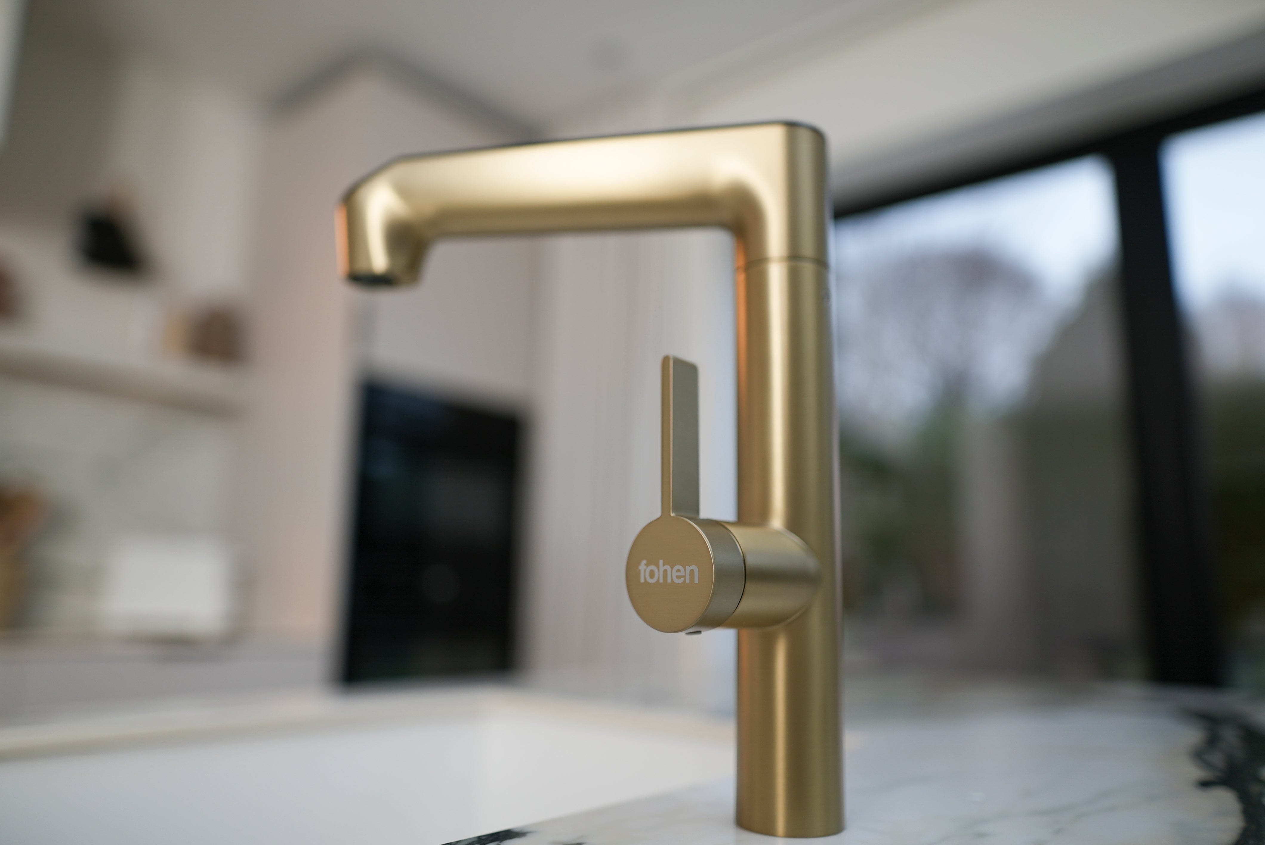
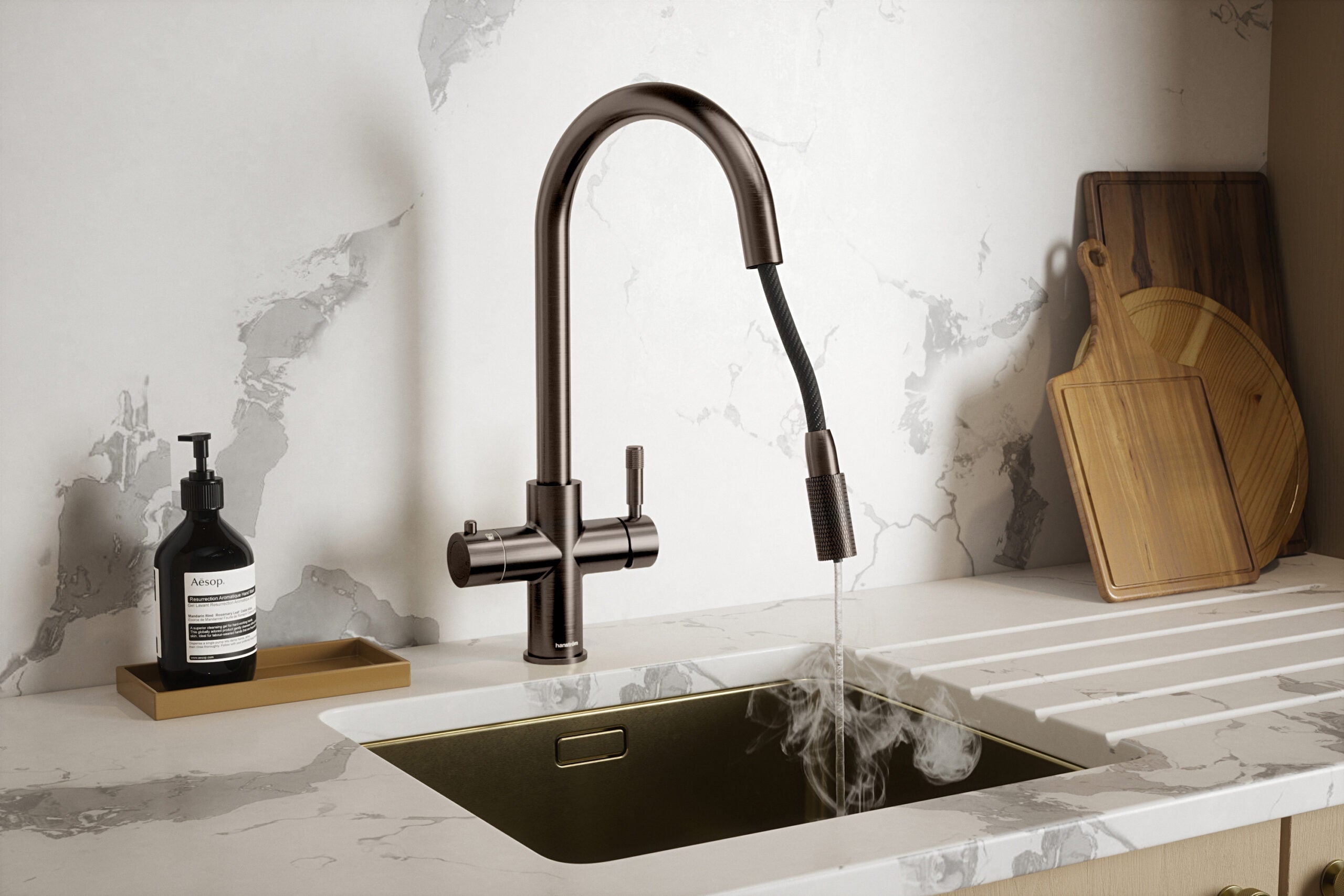
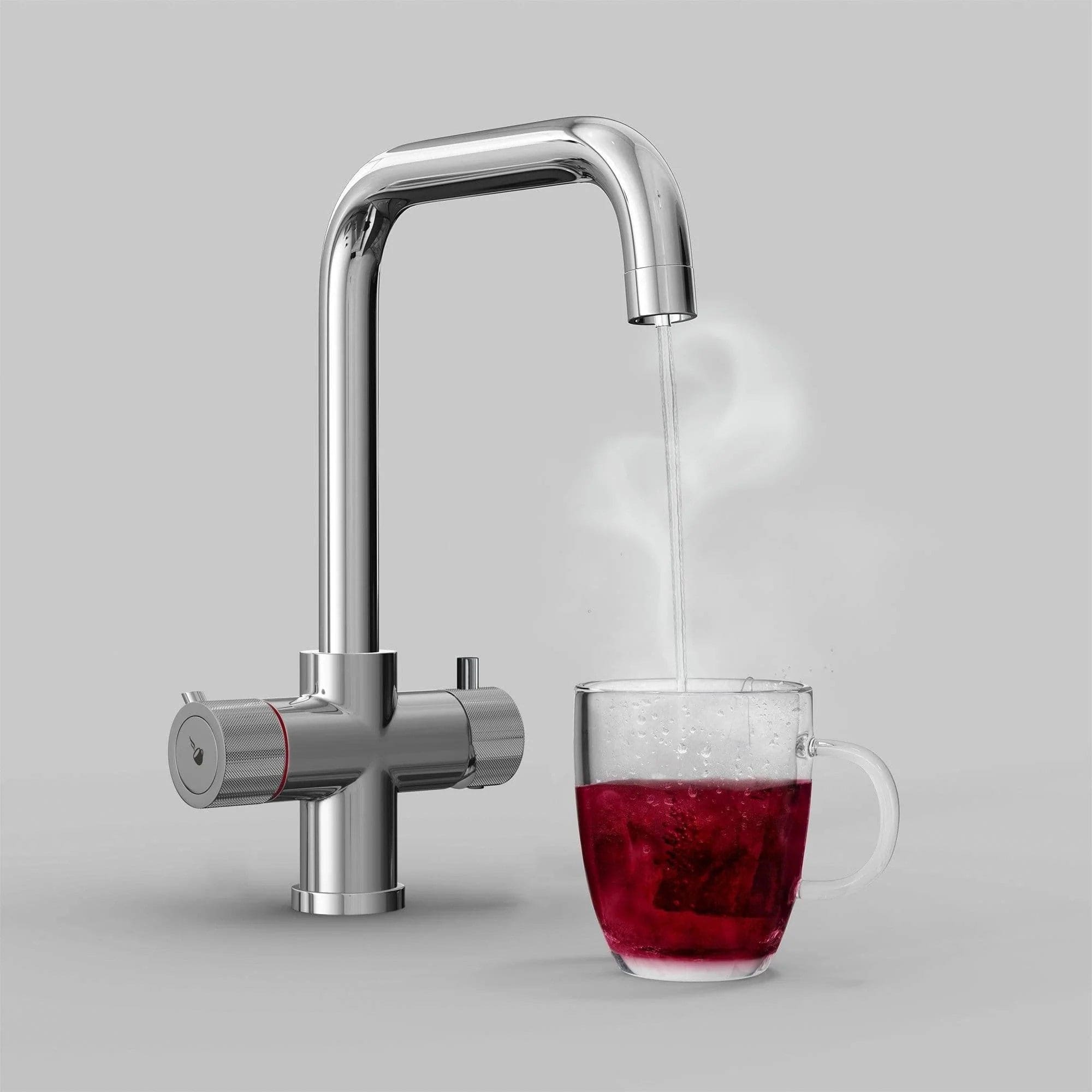
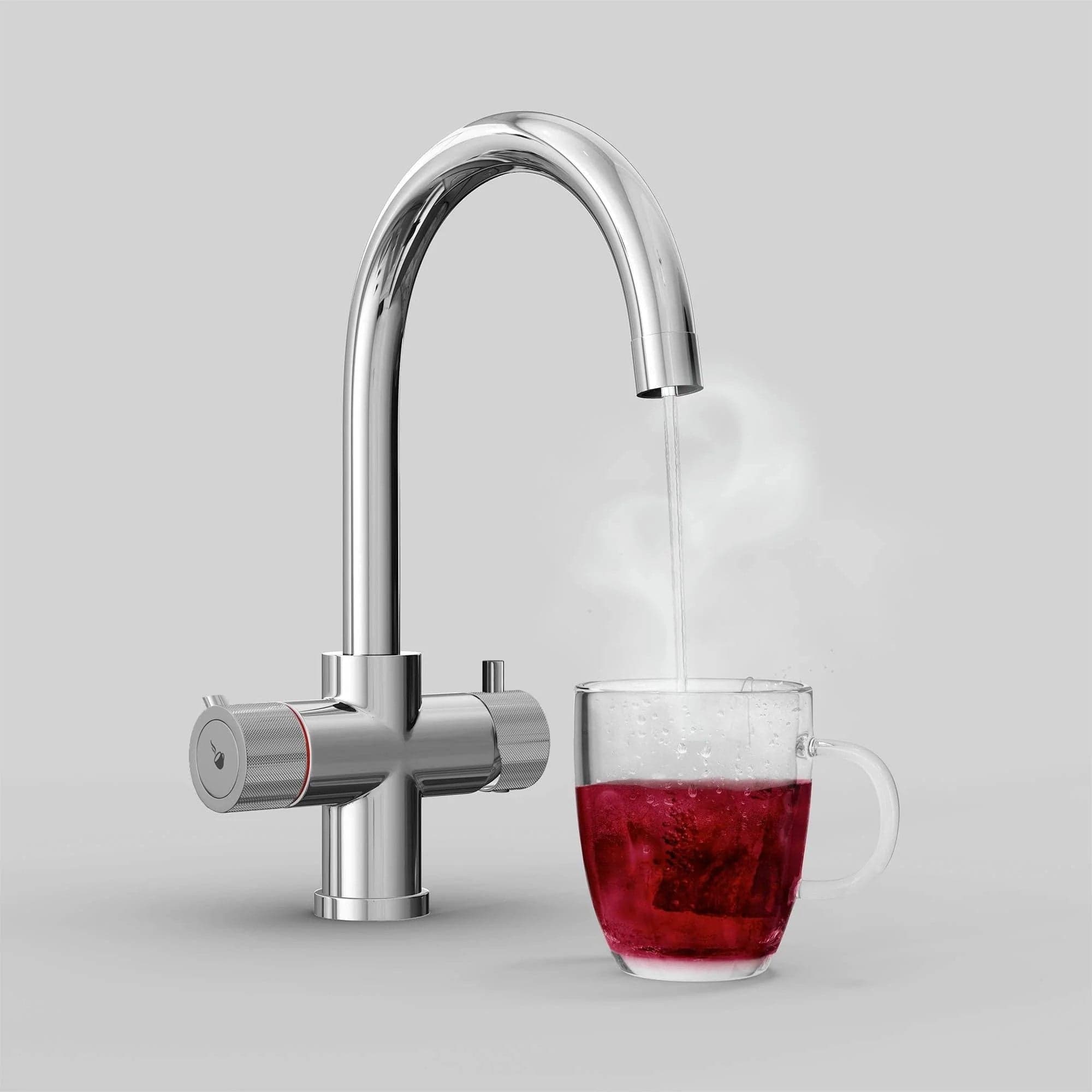
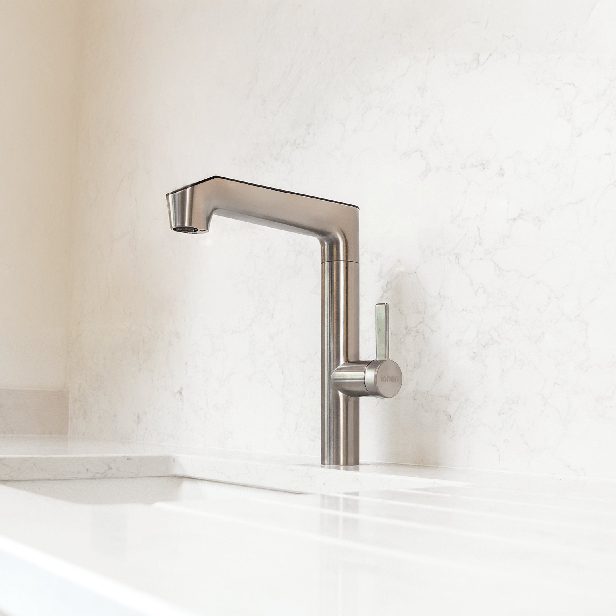
Little details build the differences. The finishes will give the final touch to your kitchen. In general, contrast shades can work. In the case of faucets, metallic classics are the safest, but coloured faucets can give a very sophisticated and modern touch. Dark and pink backgrounds can match wonder with brass-coloured pieces, and blacks and whites are being used in many modern kitchens. For inspiration, view the full range of Fohen instant boiling water taps.

